Best Responsive Design Tools in 2026
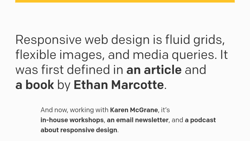
Fluid grids, flexible images, and media queries — the original framework for responsive web design, now with workshops, a newsletter, and a podcast.

A Chromium-based development browser that lets you build and test responsive, accessible websites across multiple viewports simultaneously — catch bug...

Design fluid responsive layouts that scale proportionally across all screen sizes without rigid breakpoints

Test every device breakpoint at once in a single window with synchronized interactions, accurate device dimensions, and responsive debugging tools bui...
Free, open source CSS framework based on Flexbox — build responsive web interfaces without writing CSS, no JavaScript required
About Responsive Design tools
MazikBox lists 5 Responsive Design tools, ranked by category relevance, then community upvotes, user ratings, and review count. Top-ranked options include Responsive Web Design, Polypane, Utopia. Most products in this category offer free or freemium access. Use the comparison table below to evaluate pricing, ratings, and platform support side by side.
Compare top 5 Responsive Design tools
Side-by-side highlights for the top-ranked products in this category. Products whose main category this is come first, then by featured placement, upvotes, ratings, and review count.
| Compare | R Responsive Web Design Product page | P Polypane Product page |  Utopia Product page |  Sizzy Product page |  Bulma Product page |
|---|---|---|---|---|---|
| Best for | Fluid grids, flexible images, and media queries — the original framework for responsive web design, now with workshops, a newsletter, and a podcast. | A Chromium-based development browser that lets you build and test responsive, accessible websites across multiple viewports simultaneously — catch bugs as you code, not in QA. | Design fluid responsive layouts that scale proportionally across all screen sizes without rigid breakpoints | Test every device breakpoint at once in a single window with synchronized interactions, accurate device dimensions, and responsive debugging tools built for web developers | Free, open source CSS framework built with Flexbox and Sass. Build responsive web interfaces with ready-to-use frontend components — no JavaScript, no CSS knowledge required. |
| Pricing | unknown | Freemium | Free | Freemium | Free |
| Platforms | Web | Web, macOS, Windows, Linux | Web | Web | — |
| Rating | — | — | — | — | — |
| Upvotes | 0 | 0 | 0 | 0 | 0 |
| Verified | No | No | No | No | No |
| Launch date | — | — | — | — | — |
Responsive Design FAQ
Common questions about this category, how we rank products, and how often the page is refreshed.
What are the best Responsive Design tools on MazikBox?
The top-ranked Responsive Design products right now are Responsive Web Design, Polypane, and Utopia. The comparison table above shows them side by side.
How do you rank Responsive Design products?
Products whose main category is Responsive Design (or one of its subcategories) are listed first, followed by products that also fit the category. Within each group we order by featured placement, then upvotes, average rating, review count, and newest listing. Featured placement is an editorial choice, not a quality score.
What pricing models are common for Responsive Design tools?
On this page you will find unknown, freemium, and free options, depending on the tool. Check the comparison table and individual product pages for specifics.
Which platforms do these Responsive Design tools support?
The products currently shown in this category support web, macOS, windows, and linux workflows. Platform coverage varies by tool, so compare product pages before choosing one.
How often is this Responsive Design page updated?
The category description and details were last edited on September 5, 2026. The product list, ranking, and counts update automatically as products, votes, and reviews change.
How many Responsive Design tools are listed right now?
MazikBox currently lists 5 Responsive Design products in this category, with more added as they meet our editorial standards and category fit.