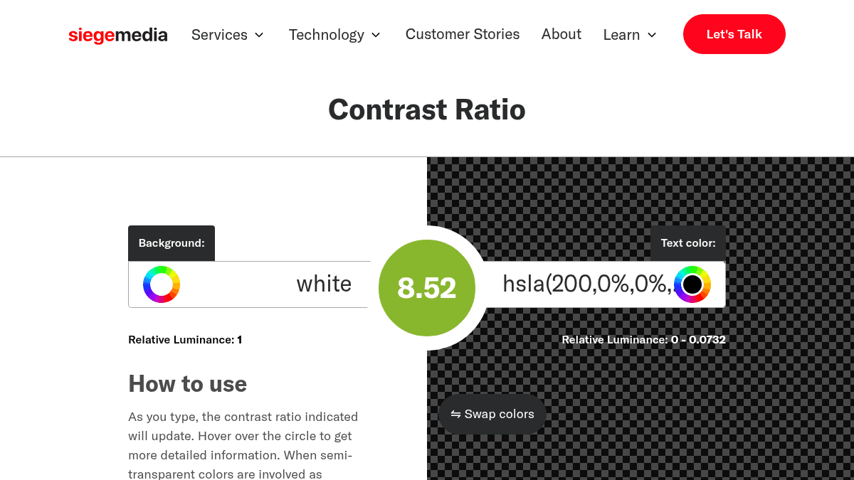
About Contrast Ratio
Overview
Contrast Ratio is a free interactive tool that calculates color contrast ratios between background and text colors according to Web Content Accessibility Guidelines (WCAG) standards. It helps web designers, developers, and content creators verify that their websites meet accessibility requirements for readability.
The tool displays contrast ratios in real-time as you input colors, with visual indicators showing whether your color combination meets WCAG standards. It was created by Lea Verou and accounts for semi-transparent backgrounds by including error margins.
Key Benefits
- Real-time contrast ratio calculation updates as you type colors into the tool.
- Visual demonstration of text readability across normal, italic, bold, and bold italic font styles and sizes.
- Hover tooltips display detailed information about the contrast ratio value.
- Handles semi-transparent background colors with error margins for accuracy.
- Free tool requires no sign-up or account creation to use.
How It Works
You enter your background color and text color into the input fields, and the contrast ratio updates automatically as you type. Hover over the circle indicator to see detailed information about the ratio, and use the swap colors button to reverse background and text values. The tool visually demonstrates how your color combination reads at various font sizes and styles to confirm readability.
Use Cases
- Web designers verifying color combinations meet WCAG accessibility standards before publishing designs.
- Frontend developers fixing Google Lighthouse errors related to insufficient contrast ratios.
- Content managers ensuring website text remains readable for users with low vision.
- Accessibility auditors checking multiple color combinations across website pages for compliance.
- UX researchers testing color palette options to balance design aesthetics with accessibility requirements.
Why Choose This Product
Contrast Ratio is ideal for anyone building or auditing websites who needs to comply with WCAG accessibility guidelines without purchasing expensive software. The tool eliminates guesswork by showing real-time feedback on whether colors meet the 4.5:1 standard for normal text or 3:1 for larger text, helping creators avoid accessibility errors before deployment.
Contrast Ratio Pros & Cons
- Free tool with no sign-up required
- Real-time updates as you enter color values
- Visual readability demonstration across font styles and sizes
- Handles semi-transparent background colors accurately
Key Features
Real-Time Ratio Calculation
Contrast ratio updates automatically as you enter or modify background and text colors.
Visual Readability Preview
Sample text demonstrates how readable your color combination is across multiple font sizes and styles.
Color Swap Function
Swap background and text colors with a single button to quickly test reversed color combinations.
Semi-Transparent Support
Handles semi-transparent background colors with error margins to account for underlying colors.
Detailed Tooltips
Hover over the contrast ratio circle to view detailed information about the current color ratio value.
Keyboard Shortcuts
Use arrow keys to increment or decrement color values in functional notation, with Shift or Alt for finer control.
WCAG 2.1 Compliance
Tool evaluates colors against Web Content Accessibility Guidelines 2.1 standards for accessibility.
Contrast Ratio Pricing
Pricing extracted from the product website and may change. Check the source for current details.
Frequently asked questions about Contrast Ratio
What is contrast ratio?
Contrast ratio is the difference between the maximum and minimum brightness of a computer display, helping measure content readability. Higher numbers indicate better readability; lower numbers suggest poor readability. A ratio above 4.5:1 is good for normal text, while larger text can dip to 3:1.
What is relative luminance?
Relative luminance is the relative brightness of any point in a colorspace, normalized to 0 for the darkest black and 1 for the lightest white, as defined by the World Wide Web Consortium.
How do I fix a Google Lighthouse contrast ratio error?
Use the Contrast Ratio tool to modify your background and font colors to create a more accessible website. Once you implement the improved colors, you should no longer receive the Google Lighthouse error about insufficient contrast.
Is Contrast Ratio free?
Yes — Contrast Ratio is free to use. See the pricing section for any optional add-ons.
What platforms does Contrast Ratio support?
Contrast Ratio is available on: Web.
How Contrast Ratio compares
C Contrast RatioThis | |||
|---|---|---|---|
| Starting price | Free | — | Free |
| Pricing model | Free | unknown | Free |
| Platforms | Web | Web | Web |
| Top features |
|
|
|
| Rating | — | — | — |
