
About Font Review Journal
Overview
Font Review Journal is an editorial publication dedicated to critical reviews of typefaces and fonts. It targets designers, typographers, and type enthusiasts who want detailed, considered analysis of typefaces rather than generic specimen pages.
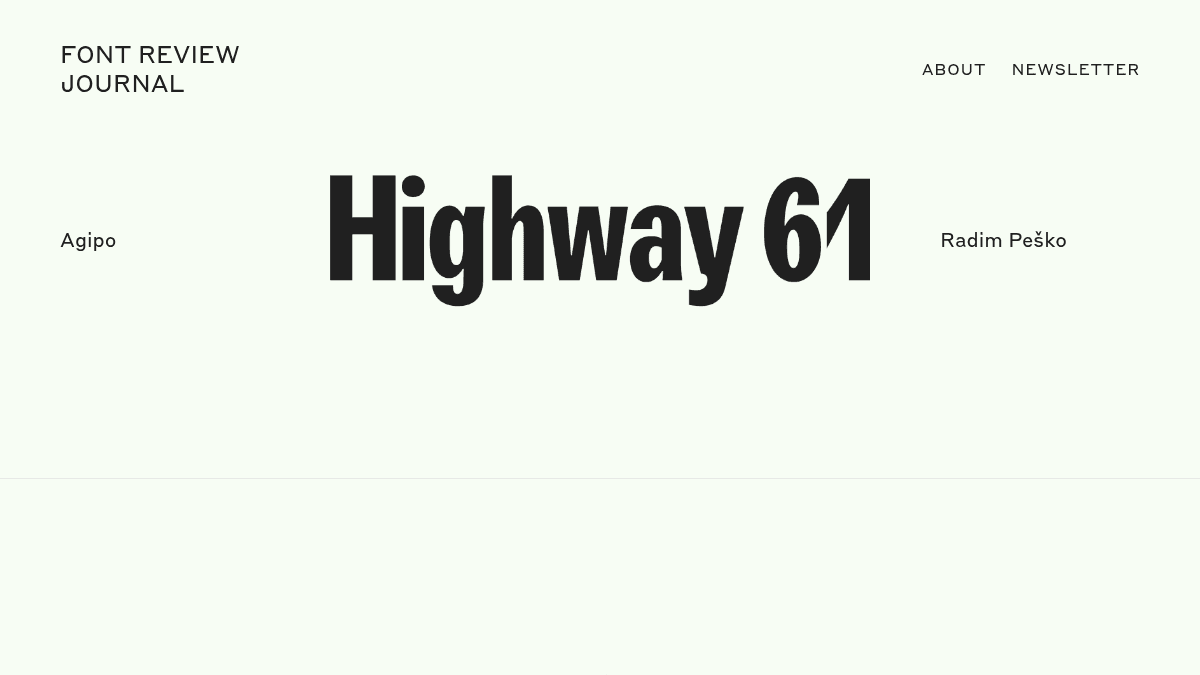
Unlike foundry marketing materials or broad font directories, Font Review Journal focuses on editorial critique, covering typefaces such as Agipo, Windsor, Untitled Sans, Champion Gothic, Aperçu, Maelstrom, Eames Century Modern, Rosart, and Sporting Grotesque.
Key Benefits
- Covers typefaces from a wide range of designers, including Radim Peško, Kris Sowersby, Jonathan Hoefler, Erik van Blokland, and others.
- Reviews span multiple type categories, from grotesques to display and script faces.
- A newsletter keeps readers updated with new reviews and typographic content.
- Free to read, with no paywall blocking access to reviews.
How It Works
Visitors browse the site to find individual typeface reviews by name or designer. Each review is accessible directly on the site, and readers can subscribe to the newsletter to receive new reviews and updates.
Use Cases
- Graphic designers researching a specific typeface before purchasing a licence.
- Type designers seeking critical peer-level analysis of contemporary and historical fonts.
- Design students learning to evaluate and articulate typographic qualities.
- Art directors comparing typefaces such as grotesques or display fonts for editorial projects.
- Typography educators looking for well-written reference material on specific typefaces.
Why Choose This Product
Font Review Journal suits readers who want editorial-quality critique of typefaces rather than automated metadata or marketing copy. The site is best for designers and educators engaged with type at a critical level.
Font Review Journal Pros & Cons
- Free to access with no paywall
- Reviews cover a diverse range of typeface styles and designers
- Includes a newsletter for ongoing updates
- Editorial critique goes beyond standard font specimen marketing
Key Features
Typeface Reviews
Each entry delivers an editorial critique of a specific typeface, covering design history, usage, and typographic qualities.
Designer Attribution
Every reviewed typeface is attributed to its type designer, such as Kris Sowersby, Jonathan Hoefler, or Erik van Blokland.
Newsletter
Readers can subscribe to a newsletter to receive new reviews and typographic updates directly by email.
Multi-Category Coverage
Reviews span a range of type styles including grotesques, display faces, scripts, and slab serifs.
Font Review Journal Pricing
Pricing extracted from the product website and may change. Check the source for current details.
How Font Review Journal compares
Font Review JournalThis | ||||
|---|---|---|---|---|
| Starting price | Free | — | Free | £17.59 |
| Pricing model | Free | contact_sales | Free | Freemium |
| Platforms | Web | Web | Web | Web |
| Top features |
|
|
|
|
| Rating | — | — | — | — |


